Brand Identity
2020
Website development Eco-safety
Eco-safety is a company engaged in the practice of environmental safety and protection of the right to a clean and safe environment for life and health
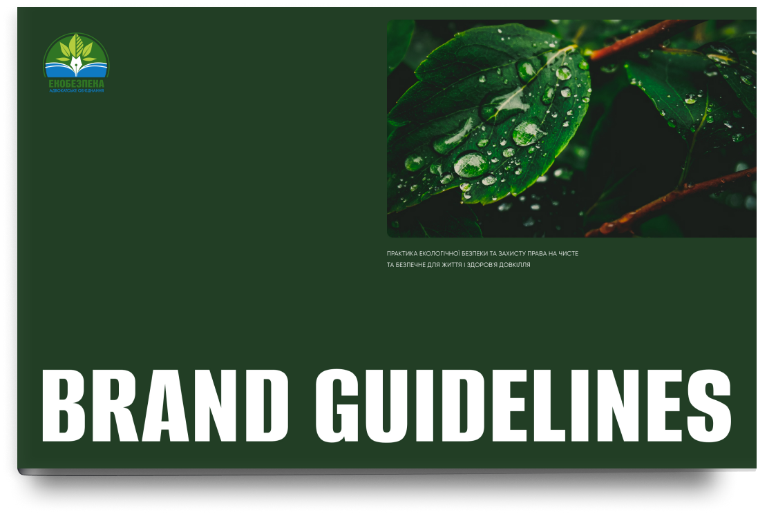
The brand guideline was aimed not only at developing technical rules for the use of corporate elements, but also at developing a bright eco-stylization
LOGO
Based on the existing company logo, additional digital adaptive variations were developed

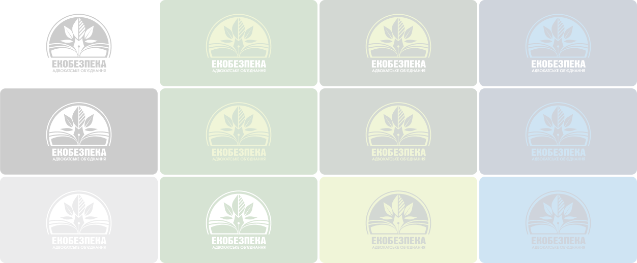
Sign
Additionally, we paid attention to the development of the brand name and its variations. This was done with the aim of using it to reinforce the brand in an informal way
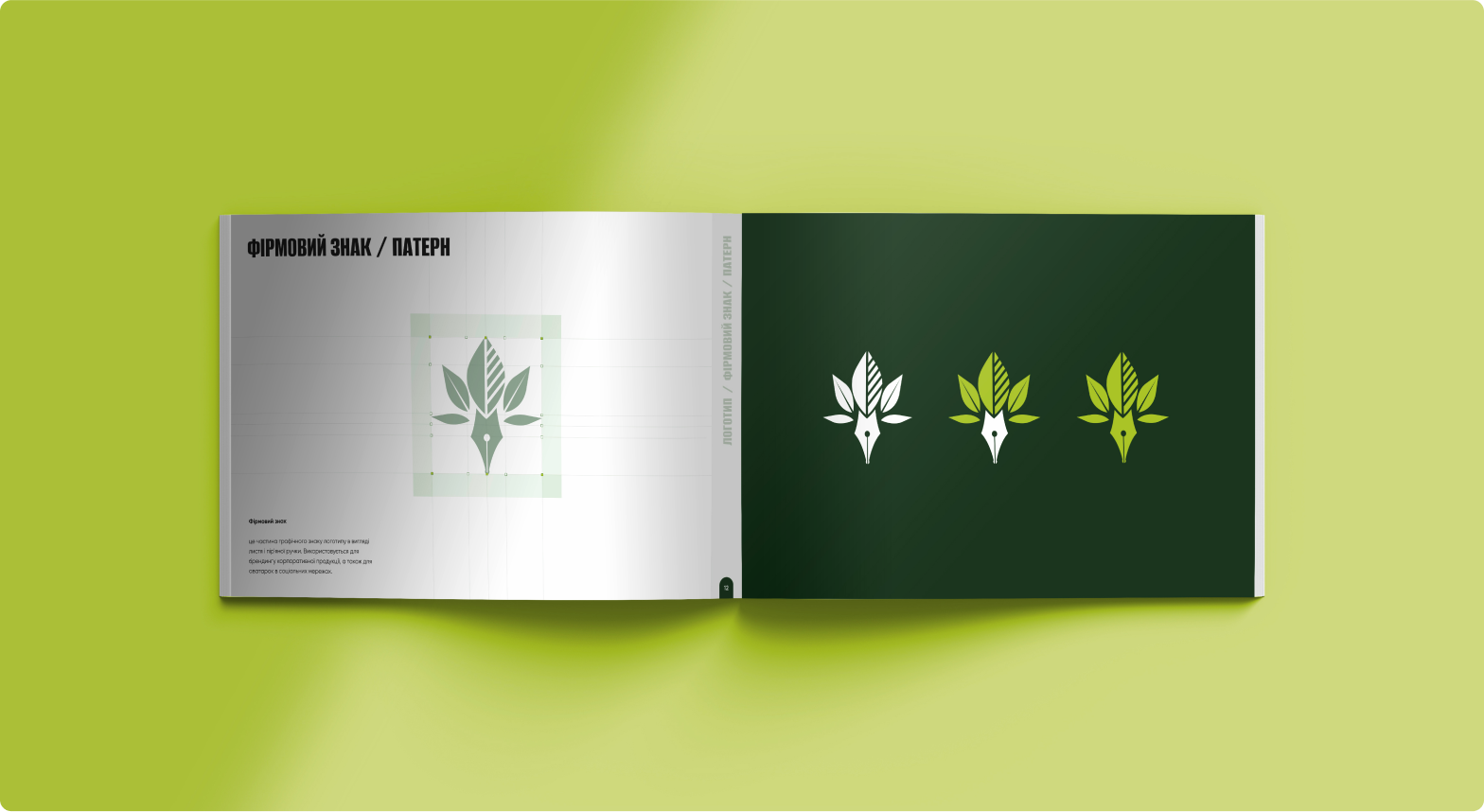
A trademark is a part of the logo graphic in the form of leaves and a feather pen. It is used for branding corporate products, as well as for avatars in social networks.



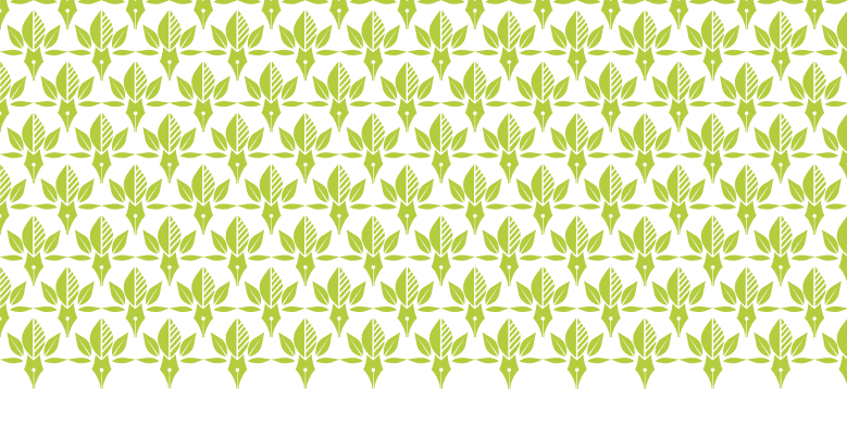
The corporate pattern consists of the sequence of the corporate logo. The colors of the pattern correspond to the main combinations of the background and logo
Color palette




The color palette was developed based on the logo, as well as on the basic shades of nature. The main images are greenery and water. An important task was to develop a solution for combining these colors in visualizations
Typography
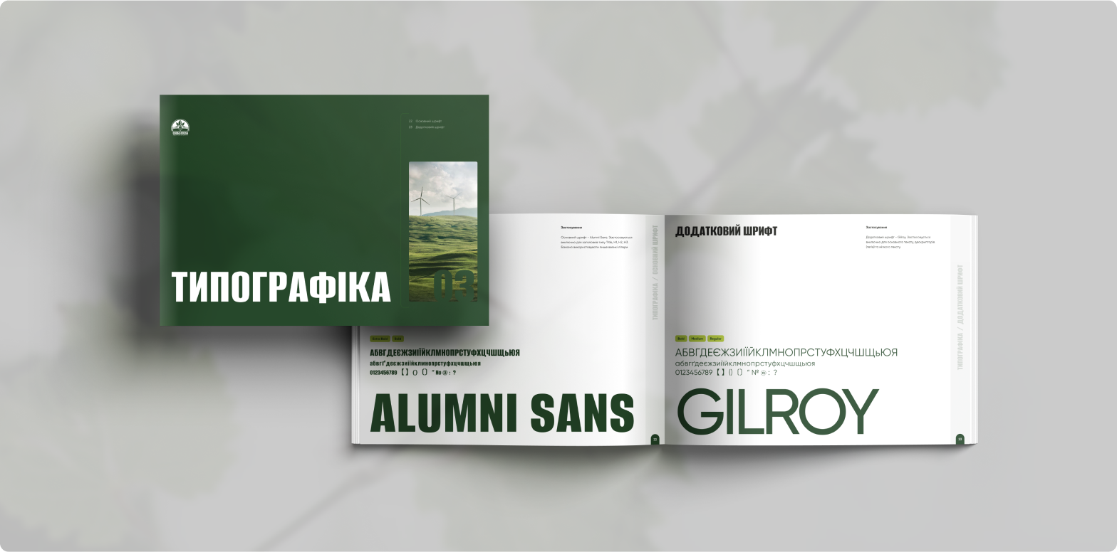

The main font is Alumni Sans. It is used exclusively for headings such as Title, H1, H2, H3.
It is advisable to use only capital letters. Additional font - Gilroy. It is used exclusively for body text, descriptors (tags), and small text.
Photo stylization

PRACTICE OF ENVIRONMENTAL SAFETY AND PROTECTION OF THE RIGHT TO A CLEAN AND SAFE ENVIRONMENT FOR LIFE AND HEALTH
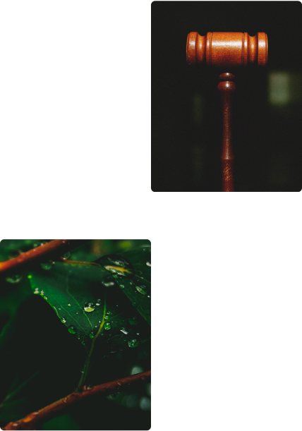

Styling: use the Lighten effect for the photo. The ideal option would be photos with a blurred background and accent objects in the foreground. Direction: it is recommended to use photos related to environmental and judicial topics
visualization
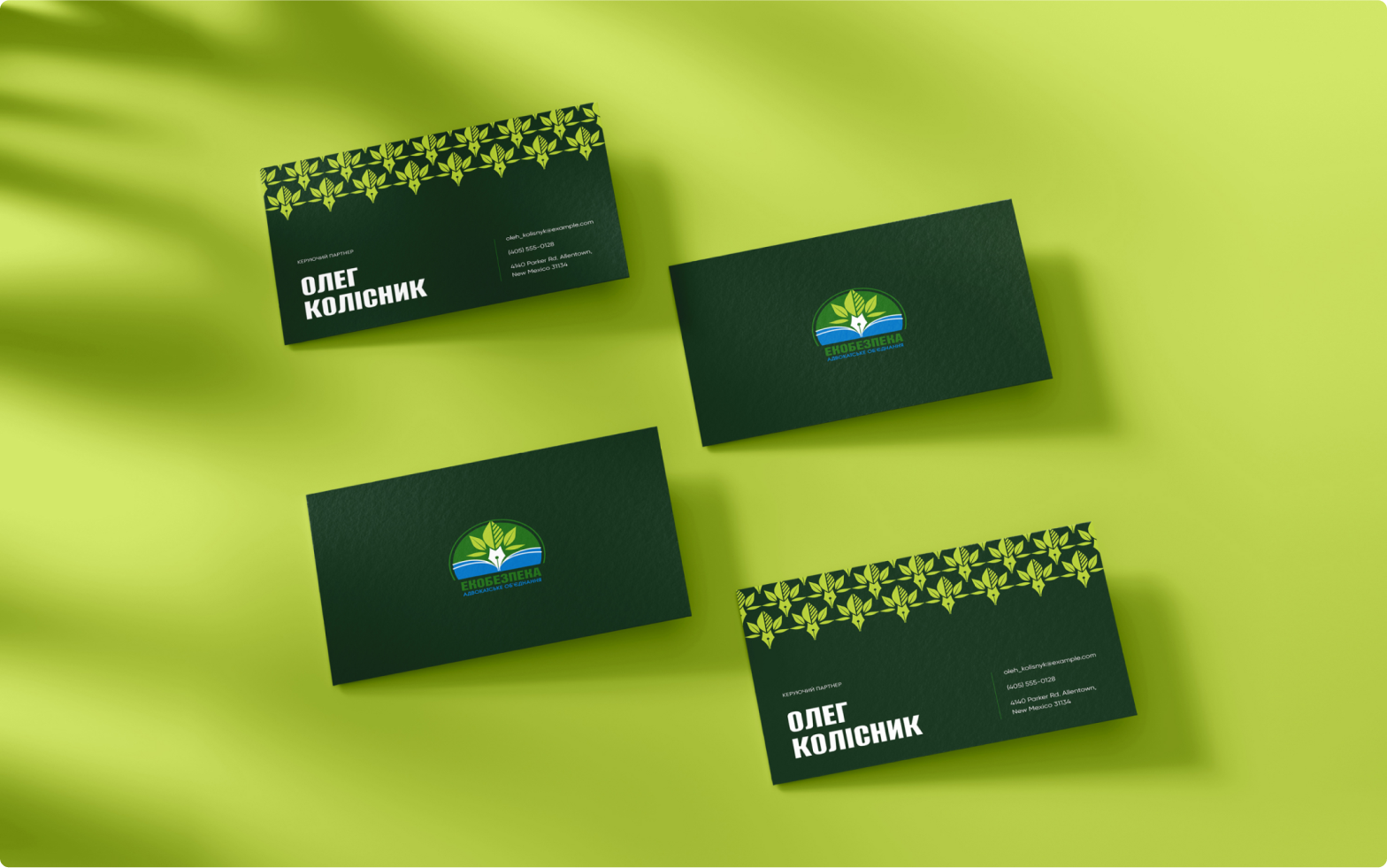
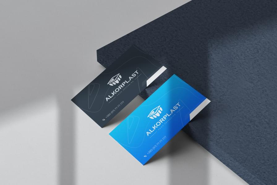
Business cards were designed with the main full-color variation of the logo. Personalized business cards are made in a minimalist style, using the corporate pattern
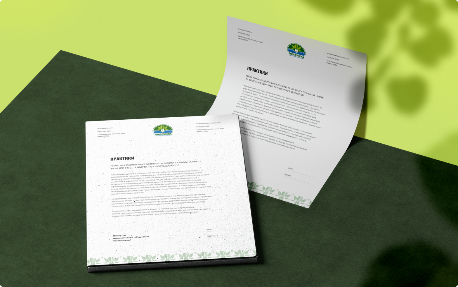
Letterheads are developed on the basis of a real prototype of a long-existing type of company document. This is done for a smooth transition of the existing style to the newly created one
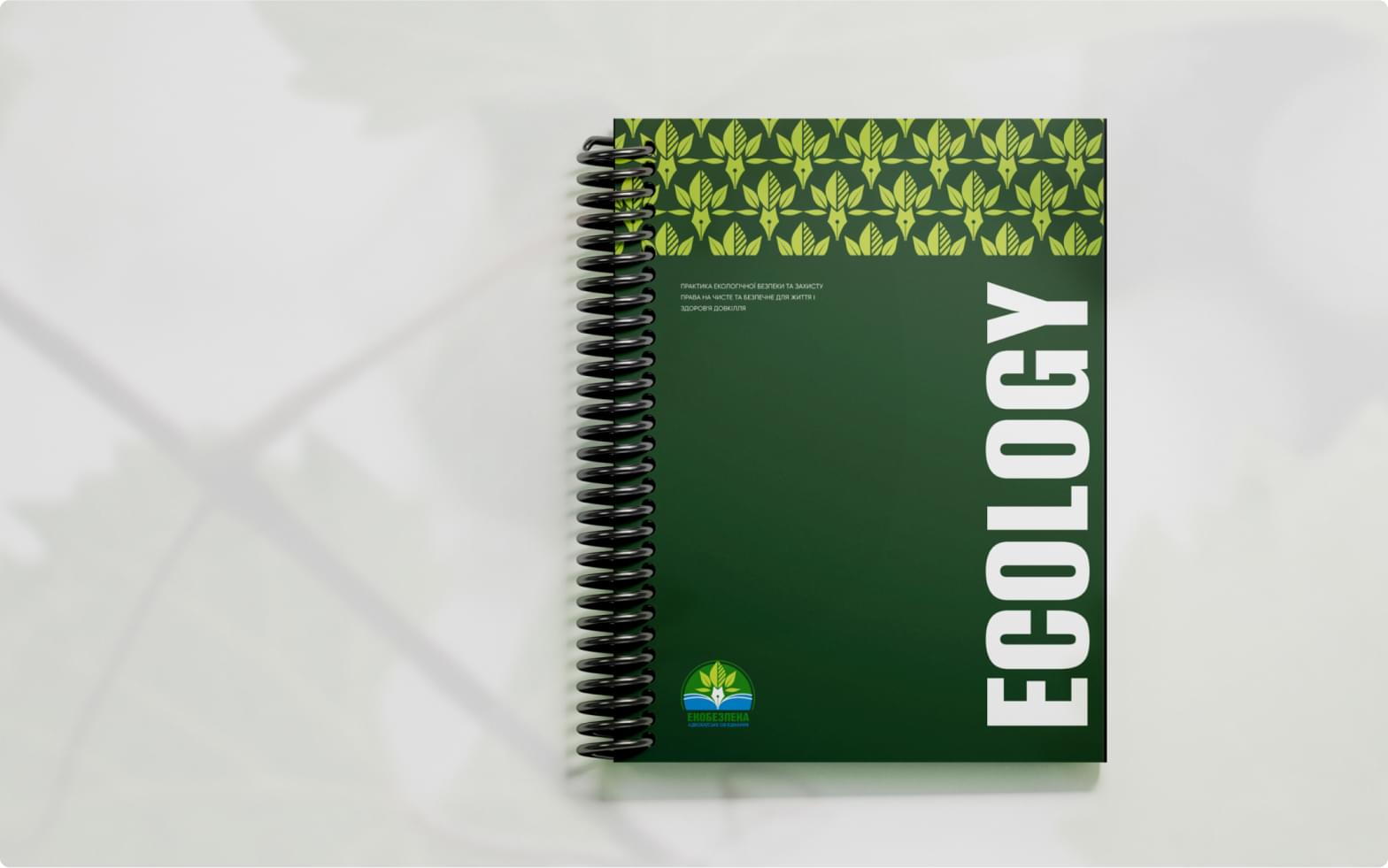
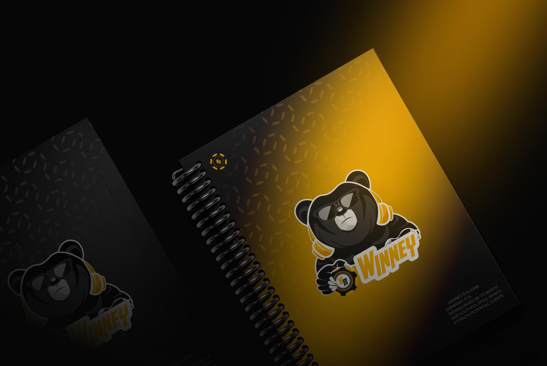
We designed the notebook using a pattern, logo and branded inscription "Ecology". Simple and straightforward, built on a four-point grid, with room for imagination
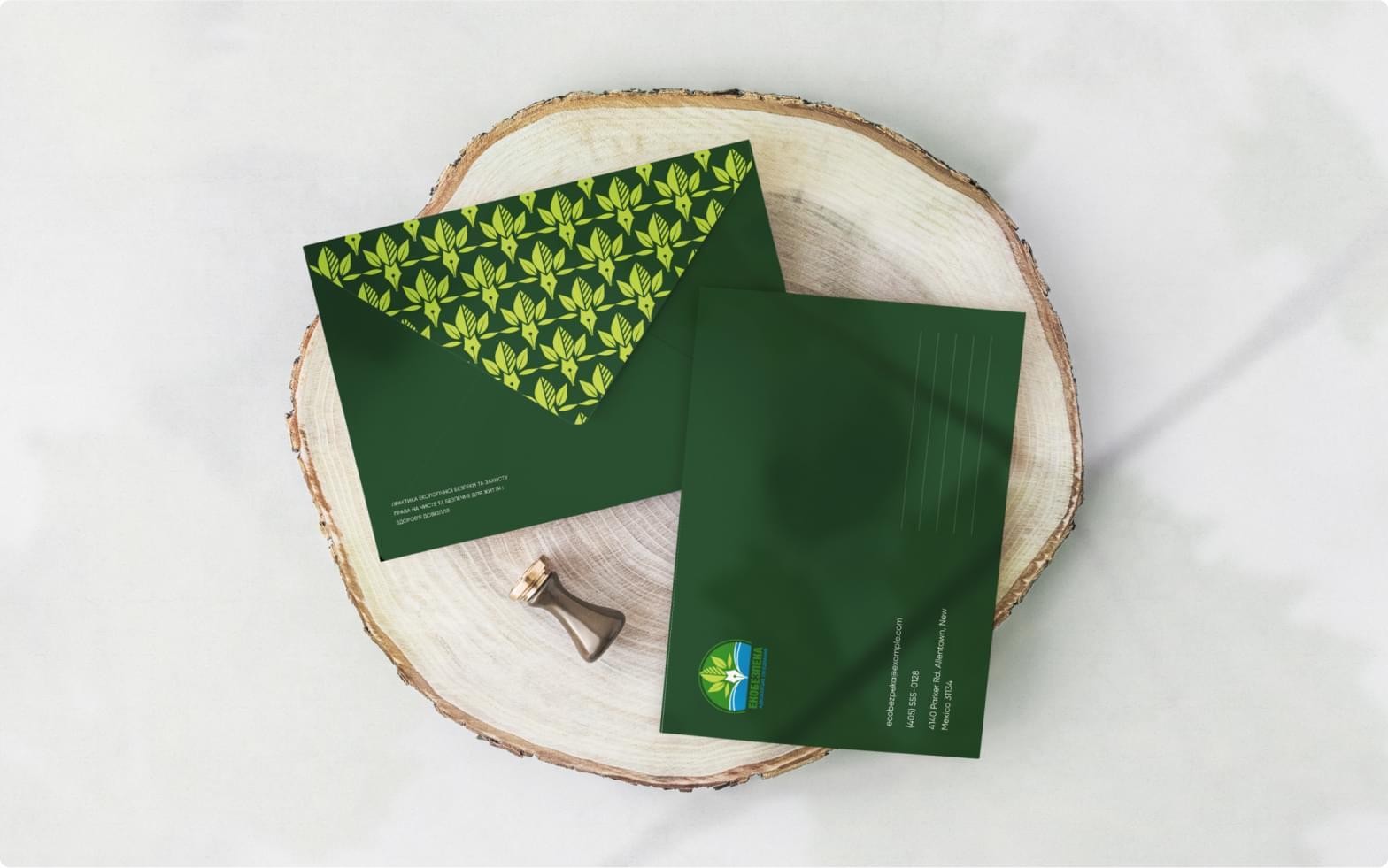
Branded letters canonically repeat the style and grid of previous corporate visualizations
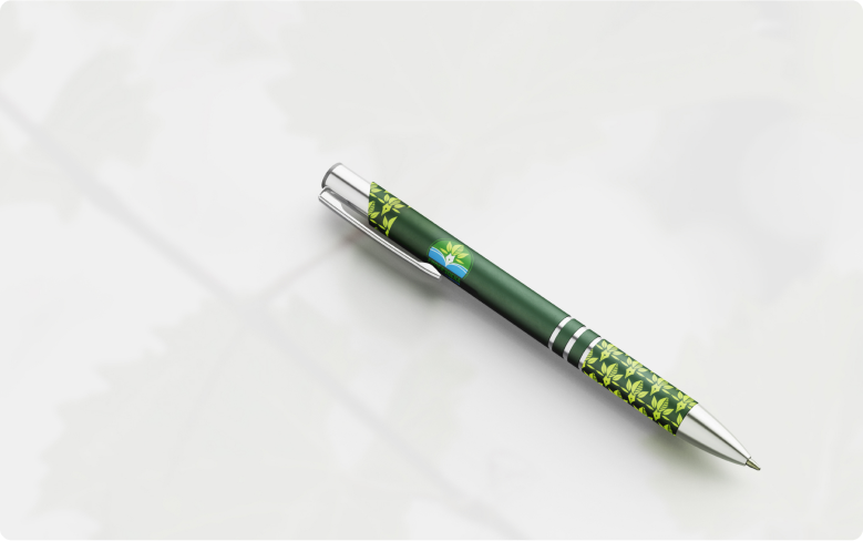
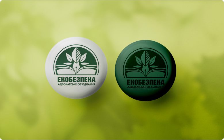
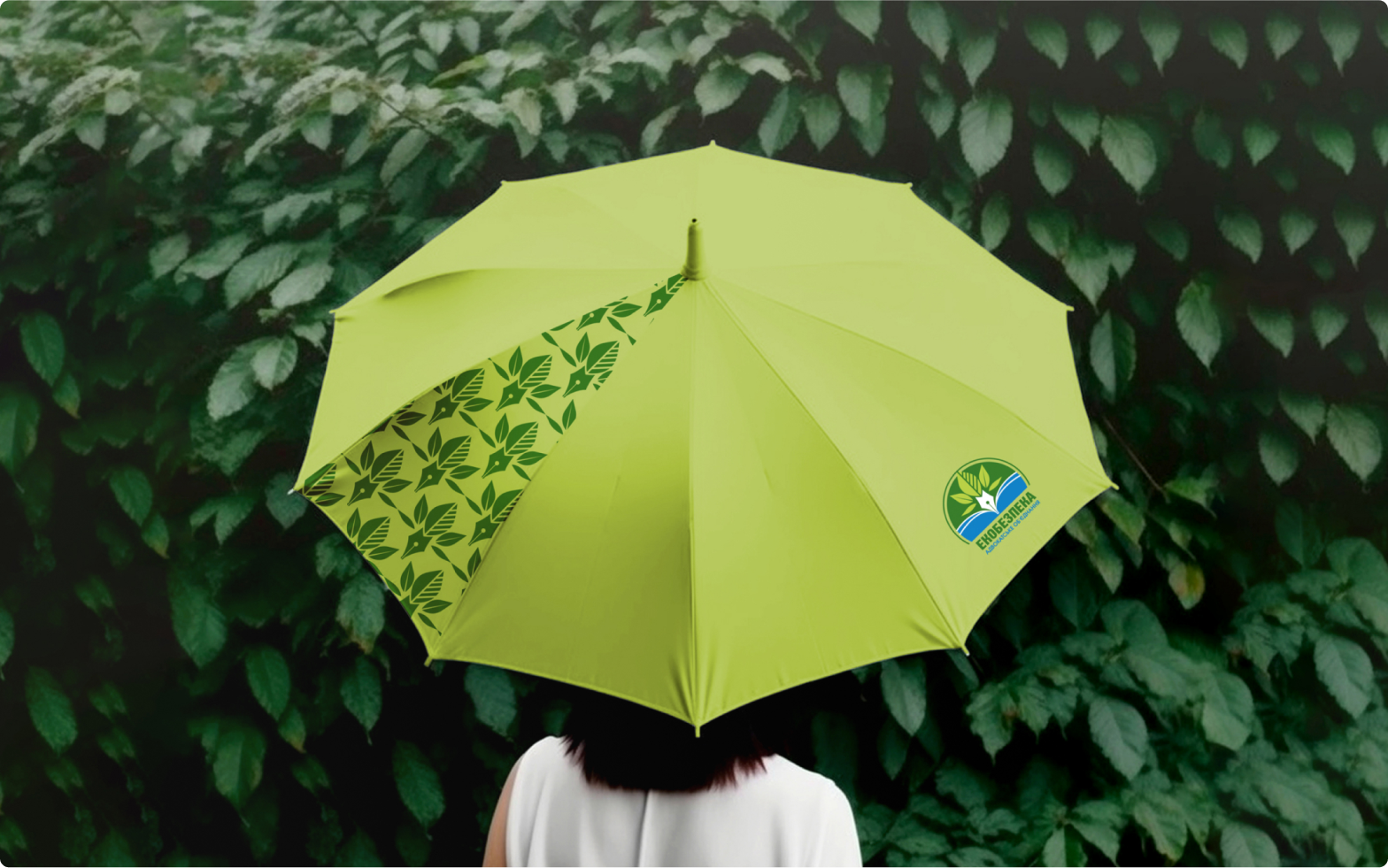

Everything we have is around us. Preserving nature and defending the rights to a clean environment is an important task for us today
What're we doing?
Related Examples
Design / Development
Are you
ready to talk?
ready to talk?
